ReviverKnight Brand
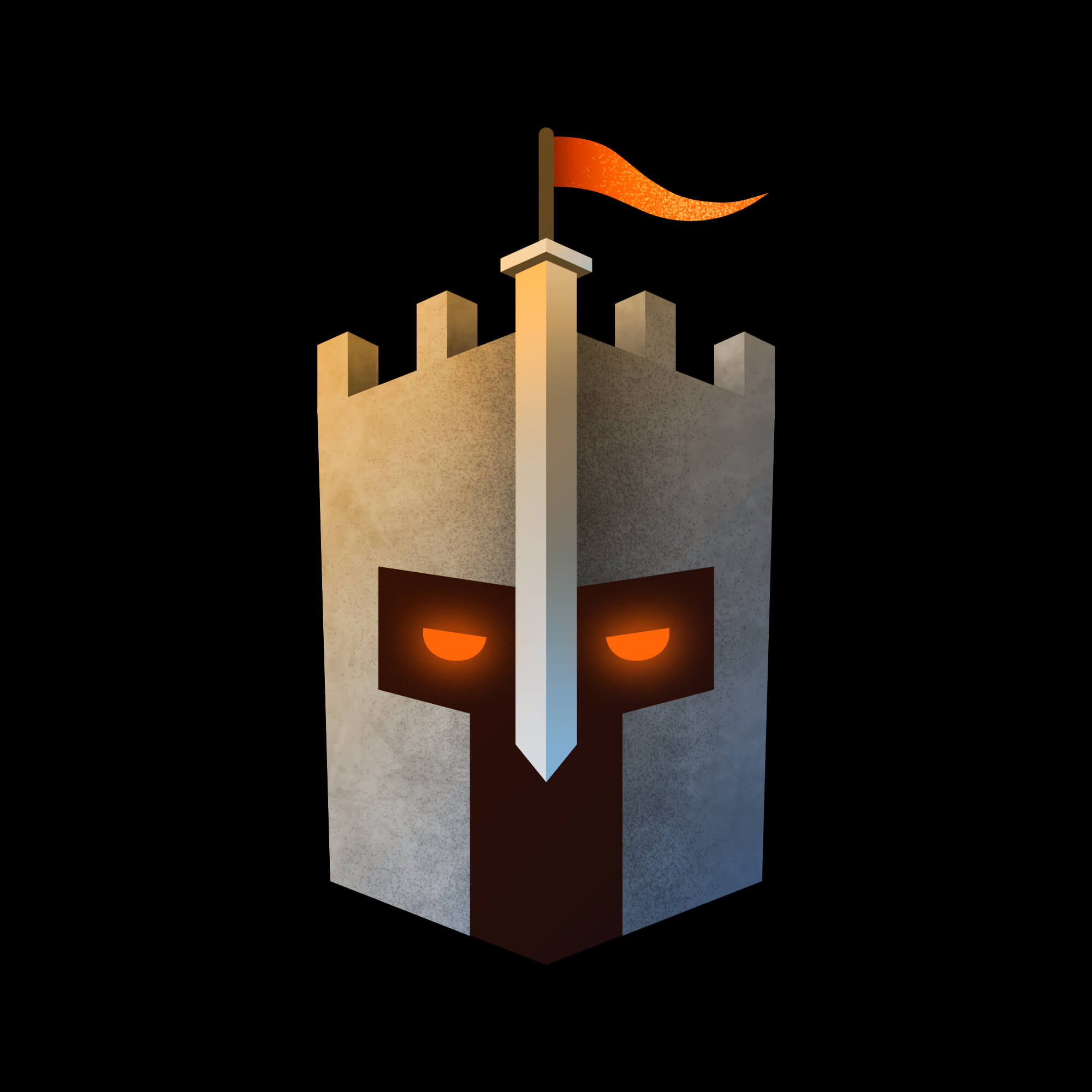
I've been developing the ReviverKnight brand on and off for a few years. This is an on-going project. For my logo I wanted to incorporate a sword, castle and knight helmet into one icon. It took months to create a design I was happy with. I'd been struggling with numerous ideas but none of them were really working for me. Then the following design came to me when I was building a castle (for another project) in Illustrator. I shared the various stages with fellow designers for feedback and ended up with the result below.
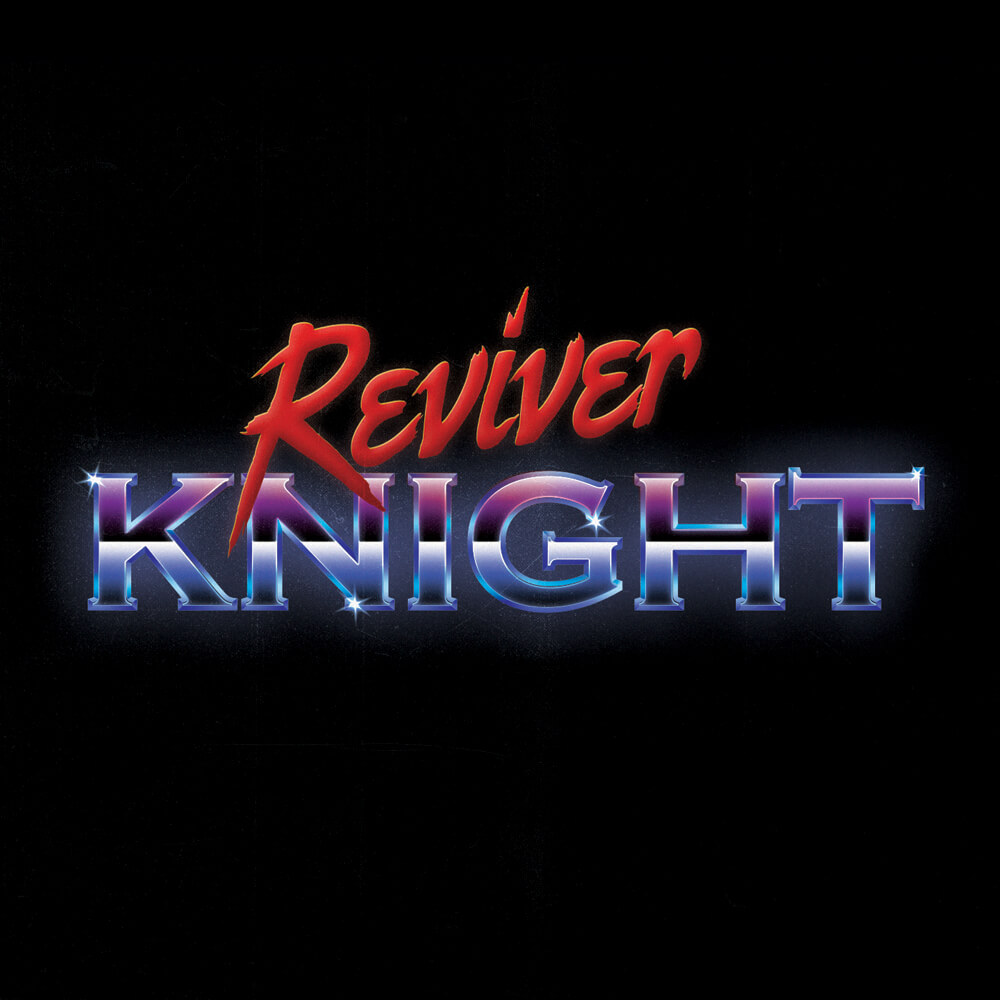
I love chrome text, so I created the text graphic below to use as a placeholder until I develop the text logo further.
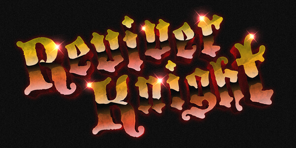
Below is a small sting usually used at some point during my video content. Based on old VHS company logos.
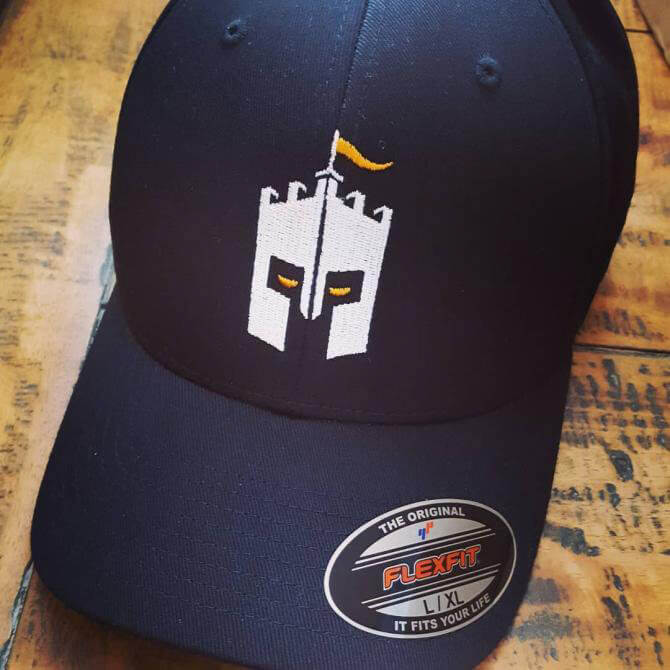
Below is the first text logo I created for ReviverKnight, clearly inspired by 80's graphics. I printed my icon onto a cap, simply because I wanted to! It's been months since I created that icon and I still love it. The far right image is me having some fun with creating some Game Boy style graphics.

I feel like my brand is developing at a slow and steady pace, which I like. There is still some work to do. Next I want to experiment and pin down the brand colours. To be continued...